
Does Font Choice and Placement Actually Matter
You have about half a second to earn attention on Instagram before someone scrolls past. That’s not an exaggeration—it’s the reality of how people consume content today. If your message isn’t immediately clear, readable, and visually intentional, it won’t matter how good the advice is. It won’t get read.
For realtors, this matters more than ever. Social media isn’t just a place to post listings or tips—it’s where first impressions are formed. And those impressions are often decided before the caption is even considered. Text placement and font choice play a much bigger role in that decision than most agents realize.
The good news is that getting this right doesn’t require design expertise or complicated tools. It requires understanding what actually stops the scroll—and what quietly pushes people away.
Why Fonts Do More Work Than You Think
Fonts aren’t just decorative. They communicate tone, professionalism, and relevance before a single word is processed. When someone sees your post, their brain makes a snap judgment: does this feel current, credible, and intentional—or outdated and forgettable?
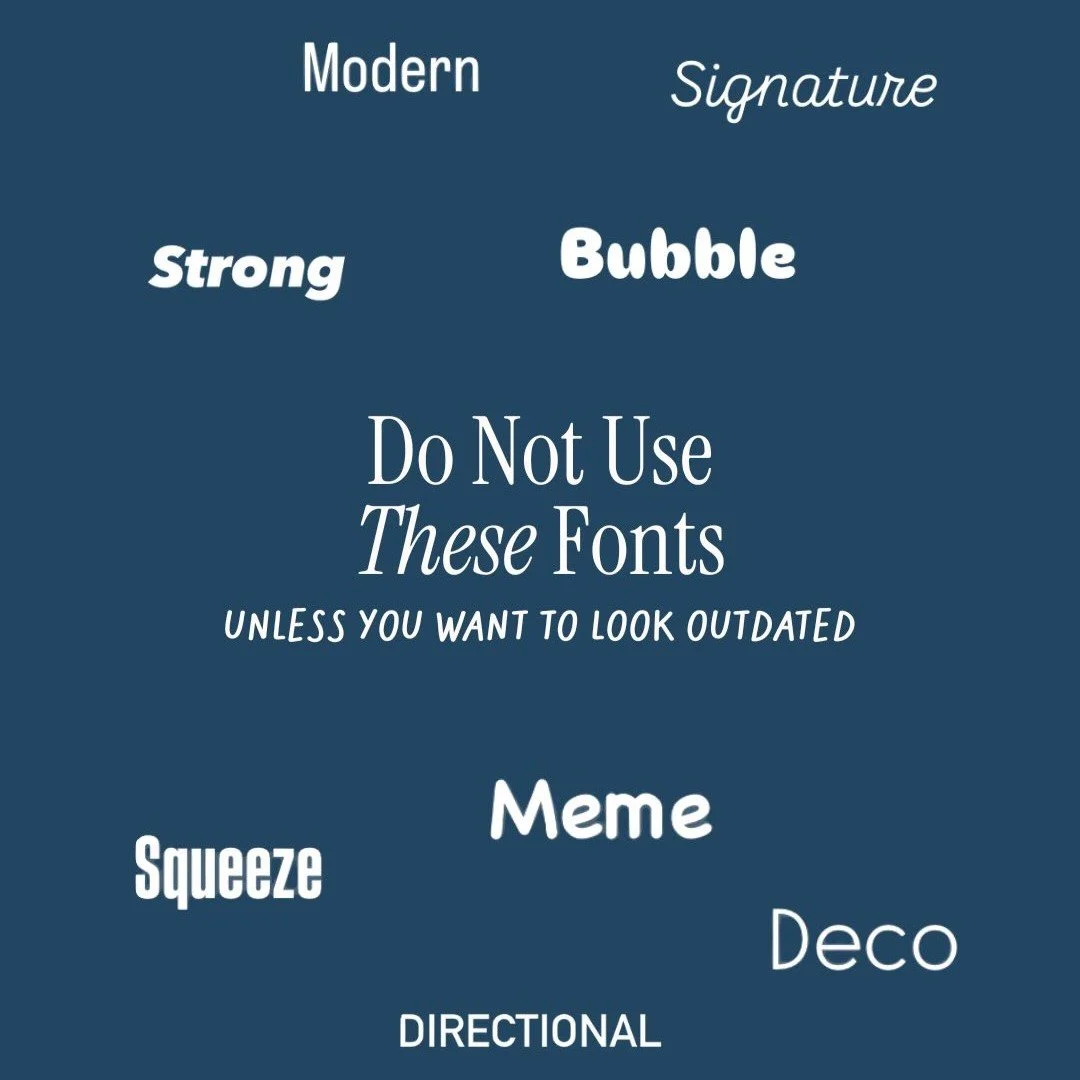
Using old, gimmicky, or overly stylized fonts instantly ages your content. Even if the message is solid, the presentation signals that the brand behind it hasn’t evolved. In contrast, clean and modern typefaces make the same message feel sharper and more trustworthy without changing a word.
Typography is part of your brand identity. It’s not a design afterthought. The fonts you use subtly tell people how seriously they should take you and whether your content is worth their attention.
Why Clean Typography Wins
Clean fonts perform better because they reduce friction. When something is easy to read, people stay longer. When people stay longer, platforms reward that content with more reach. It’s a simple chain reaction.
Polished typography helps your content feel intentional rather than rushed. It also signals that you care about the details, which matters in an industry where trust and professionalism are everything. Buyers and sellers may not consciously think about fonts—but they feel the difference.
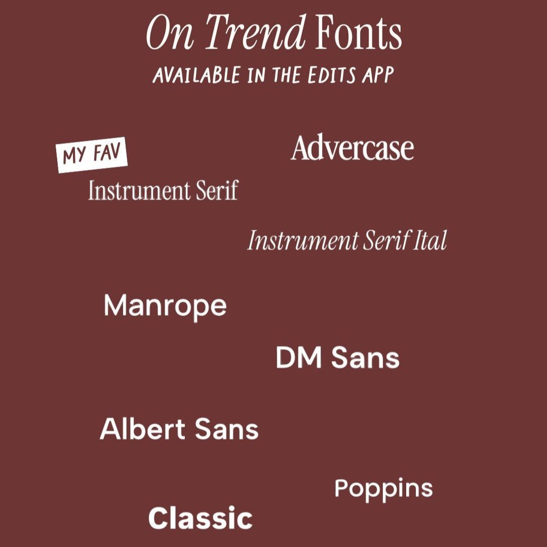
The typefaces performing best right now tend to share a few characteristics:
Simple letterforms without excessive decoration
Strong contrast against the background
Easy readability at small sizes
These fonts don’t distract from the message. They support it.
Text Can Make or Break Your Video
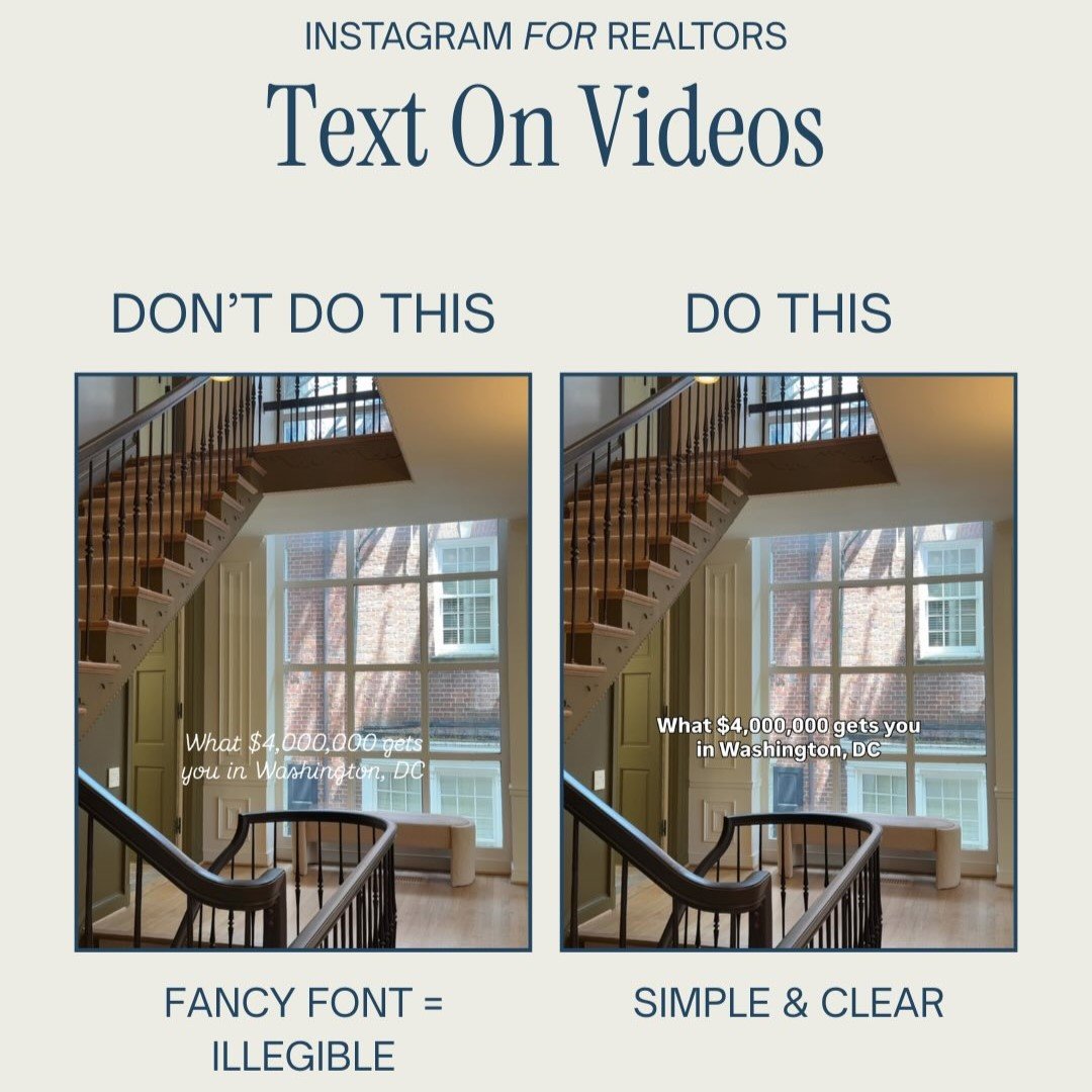
Even the best font won’t help if it’s placed poorly. Text placement is one of the most common reasons good content fails. If people have to squint, tilt their phone, or re-read your text, they’ll scroll past instinctively.
People consume most content with the sound off. That means your on-screen text has to do the heavy lifting immediately. The message should be obvious within the first second—no effort required.
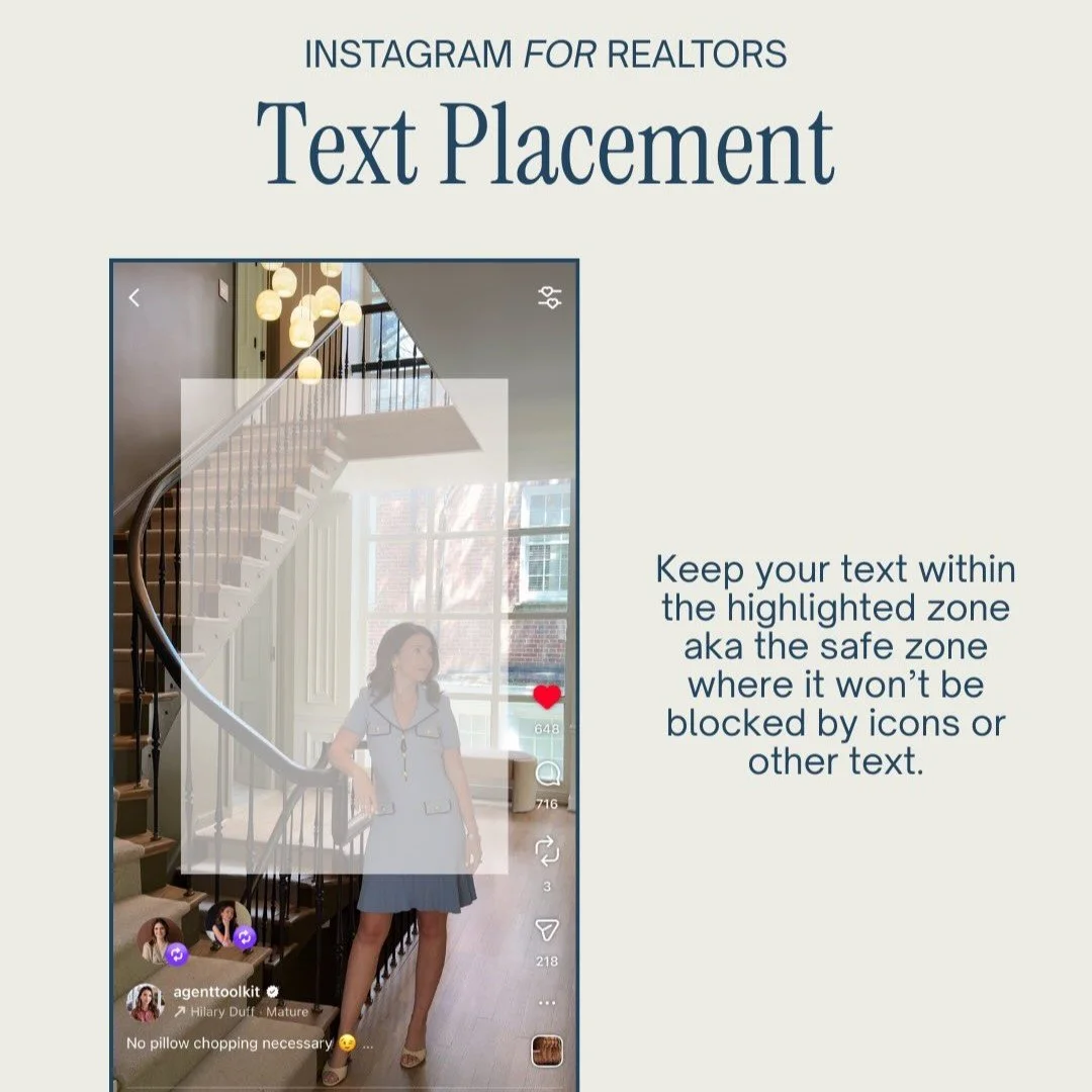
Poor placement often happens when text is pushed too close to the edges of the screen or overlaps with platform icons, captions, or buttons. When that happens, your message literally gets covered up. If it’s not fully visible, it won’t get read.
Why Simple Beats Stylish Every Time
Stylish fonts can be tempting, especially when you want your content to stand out. But if your font forces people to slow down to understand it, you’ve already lost them.
Clarity always beats creativity when it comes to scroll-based platforms. The goal isn’t to impress someone with design—it’s to communicate a message instantly. Clean fonts with strong contrast outperform decorative ones because they remove barriers between the viewer and the message.
This doesn’t mean your content has to look boring. It means your design choices should serve the message instead of competing with it. When text is clear, people focus on what you’re saying, not how hard it is to read.
Why Text Placement Is a Strategic Decision
Text placement isn’t just about aesthetics. It’s about function. Where you place your text determines whether it gets noticed or ignored.
Placing text too low means it gets covered by captions. Placing it too high risks getting cropped. Placing it too close to the sides means it competes with interface elements. All of these mistakes quietly reduce performance.
Effective content respects the safe zone. That’s the central area of the screen where text remains visible across devices and formats. Keeping your text within that zone ensures your message lands clearly and immediately.
When text placement is intentional, your content feels easier to consume. When it’s careless, viewers move on without realizing why.
Why These Details Matter for Realtors Specifically
Real estate content isn’t entertainment for entertainment’s sake. It’s trust-building. Every post either reinforces your credibility or subtly undermines it.
When your text looks outdated, cluttered, or hard to read, it signals disorganization—even if unintentionally. When it looks clean, modern, and clear, it signals professionalism and confidence.
This matters because people hire agents they trust. And trust starts forming long before a DM or consultation. It starts in the feed, often in less than a second.
How Better Design Supports Better Results
Good design doesn’t replace good messaging—it amplifies it. When your text is easy to read and placed intentionally, people actually absorb what you’re saying. That leads to more watch time, more saves, and more shares.
Over time, those signals help your content reach more of the right people organically. Better reach leads to familiarity. Familiarity leads to trust. Trust leads to conversations.
This is how small design improvements compound into real business results.
Making This Easier Without Overthinking It
Most realtors don’t struggle because they lack ideas. They struggle because content creation feels overwhelming and inconsistent. Fonts, placement, and formatting become decision fatigue—especially when you’re already juggling clients and transactions.
This is where systems matter. When your content structure, typography, and layout are already decided, posting becomes faster and more consistent. You’re no longer reinventing the wheel or guessing what looks right.
With Agent Toolkit, you don’t have to figure this out on your own—it provides done-for-you content templates with clean typography, intentional text placement, and layouts designed to stop the scroll and attract the right clients.
Clarity Is the Competitive Advantage
Content doesn’t win by being louder. It wins by being clearer. Clean fonts, readable text, and intentional placement aren’t design trends—they’re attention tools.
When your message is obvious at a glance, people stay. When they stay, your content works. And when your content works consistently, your brand grows without needing constant reinvention.
You don’t need to redesign everything. You just need to stop making it hard to read.